
Brown or Grey ?
Another rainy day in Chennai and few more experiments. I dont know which one of these i like more. In first sepia tone is coming out well and second looks so much like a sketch. Any comments ?
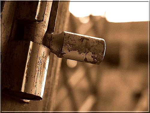
(ISO 100, f/2.8, Shutter Speed 1/250 sec)
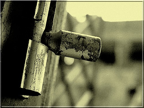
(ISO 100, f/2.8, Shutter Speed 1/250 sec)
posted by ~ Deeps ~ @ 3:52 AM
![]()
9 Comments:
Oh my God [Chandler style]! You do amazing stuff..!
Second one appeals to me a lot more. I just think it stresses a lot more effect on the subject. And it looks awesome. I think it's something to do with the contrasting appeal there. But sepia one here can't be compared with the B&W one.
Anyone out there to agree with me?
I will agree with Rohit.. the yellow tint looks better to me.. sepia in my opinion is not a good tone for extreme closeups.. sepia has always been a way for me to infuse a warmth in the picture. For stark metallic subjects a more bold tint like the one you've used works better... That reminds me I have to experiment too...
@rohit & Palak
thanks people.....even i agree with u people on this.......
all the best for experiments palak :)
i like second one ...kaante ki yaad aa gayi n somehow loved that
May I disagree completely with everyone here and say that I like the first one more? Somehow that has more depth and character...
Great shot! I like the tone in the first one..
hmmm.....i like both pic
so no qu of chosing bet both of them:)))))
@chitra
well never thot in kaante way....but yeah the tint is same...
@Woodsmoke
u can ofcourse disagree....i posted both cuz i liked both of them too :)
@samcam
thanx...hope to c u again at my blog....
@megha
now thats wat i call diplomatic ans....princess :D
the textures have been captured reaally well.
Post a Comment
<< Home